
Profitability #2 — Menu engineering: let margin and popularity redesign your menu
A $30 steak at 30% food cost makes $21 profit. A $10 pasta at 20% food cost makes $8. The pasta looks better on a food-cost report and worse on the bank statement. The 1982 framework that classifies every dish as a Star, Plowhorse, Puzzle or Dog, what actually changes what diners order (and what's an eye-tracking myth), and how to run the analysis on numbers you can trust.
The cheapest dish to make is not the one making you the most money
A $10 pasta costs $2 to make: 20% food cost, a number that looks excellent on a report. A $30 steak costs $9 to make: 30% food cost, a number that looks worse on the same report. Sell one of each, and the steak just put $21 in the till against the pasta’s $8. If a menu gets designed — consciously or not — around minimizing food cost percentage dish by dish, the dish getting pushed hardest is sometimes the one contributing the least real money to the register. Food cost percentage is a ratio. What actually pays rent is a dollar amount.
The four-quadrant framework that started it
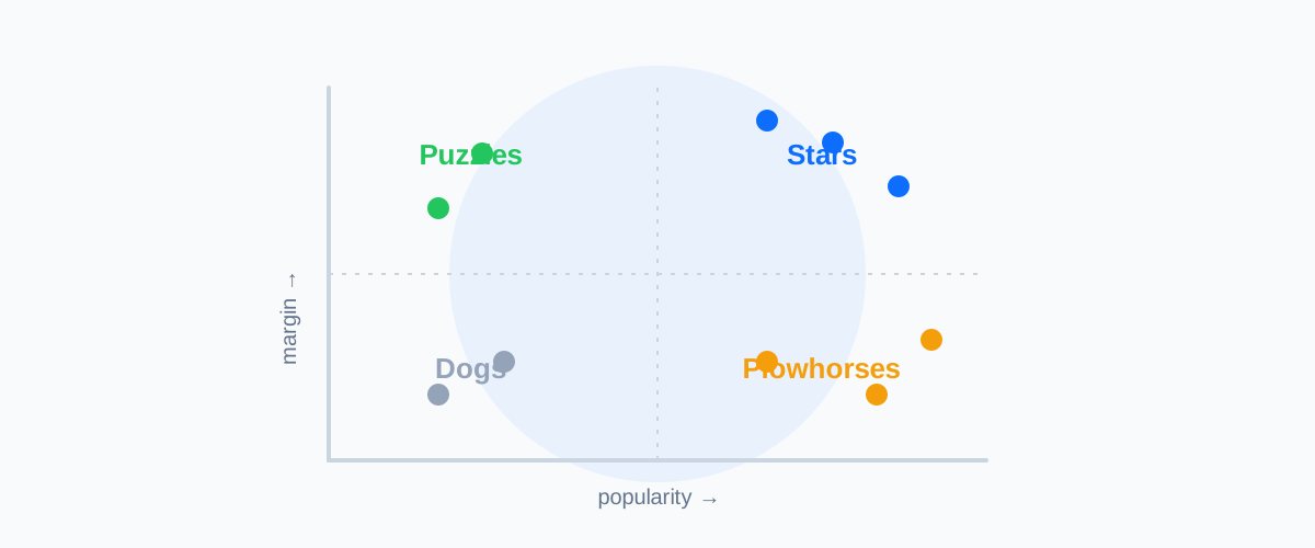
The formal discipline of designing a menu around profitability and popularity together dates to a specific book: Michael Kasavana and Donald Smith, both then at Michigan State University’s School of Hospitality Business, published Menu Engineering: A Practical Guide to Menu Analysis in 1982. It renamed and formalized an earlier, cruder “Winners / Marginals / Losers” model, replacing it with a two-by-two matrix — contribution margin on one axis, popularity on the other — that sorts every dish into one of four categories:
- Stars — high popularity, high contribution margin. The dishes actually running the business. Protect them: don’t quietly raise the price until guests notice, don’t let the recipe drift, and don’t bury them on the page.
- Plowhorses — high popularity, low contribution margin. Guests love them; they barely pay for themselves. Candidates for a smaller portion, a cheaper garnish, a small price increase, or repositioning next to a higher-margin item — carefully, since these are also the dishes most likely to define a guest’s sense of value.
- Puzzles — low popularity, high contribution margin. Profitable every time someone orders one; almost no one orders one. Often a placement or description problem, not a recipe problem — before cutting a Puzzle, try making it easier to notice and easier to want.
- Dogs — low popularity, low contribution margin. Doing nothing for the guest experience and nothing for the bank account. The default candidates to cut, unless one is quietly serving a purpose the numbers don’t capture — a dietary option, a dish that anchors a higher-priced neighbor on the page.
Why food cost percentage is the wrong thing to optimize
The $10-pasta-versus-$30-steak comparison above is the entire argument in miniature: a kitchen chasing the lowest food cost percentage, item by item, will systematically favor small, simple, low-ticket dishes over larger, higher-quality ones — even when the larger dish makes more actual profit per plate. Contribution margin (selling price minus ingredient cost) is what a menu should be engineered around; food cost percentage is a useful diagnostic for a single dish’s efficiency, not a target to minimize across the whole menu.
What actually changes what people order — and what’s a myth
Menu design has real, tested findings behind it — and also a lot of confidently repeated folklore. Worth knowing which is which before redesigning anything.
The “sweet spot” is mostly a myth. A common piece of menu-consultant advice claims diners’ eyes land first on the top-right corner of a page — the menu’s “sweet spot” — and that the highest-margin items should be engineered to sit there. Cornell hospitality researcher Sybil Yang ran an infrared eye-tracking study on real menus and found no statistically significant sweet spot at all: diners scan a menu roughly sequentially, the way they’d read a page of text, and some of the zones popular consultants treat as prime real estate actually underperformed as a “sour spot” instead. Placement matters less than the folklore suggests; what a dish says about itself seems to matter more.
Dropping the dollar sign measurably increases spend. A 2009 study by Yang, Sheryl Kimes and Mauro Sessarego (Cornell School of Hotel Administration, with the Culinary Institute of America), covering 201 diners, found that menus listing prices as plain numerals — no ”$” — produced roughly 8% higher average spend, about $5.55 more per visit, than menus using the dollar sign. Spelling the word “dollars” out in full performed no differently than using the symbol — it’s specifically the visual currency symbol that appears to prime price-consciousness, not the underlying concept of money.
Descriptive names sell more — with a caveat worth stating plainly. A 2001 study by Brian Wansink, Painter and Van Ittersum, published in the Cornell Hotel and Restaurant Administration Quarterly, ran a six-week field trial with 140 customers in a university cafeteria and found that descriptive names — geographic, nostalgic or sensory language, like “Grandma’s zucchini cookies” instead of plain “zucchini cookies” — raised sales 27% and improved how customers rated the food’s taste and value. It’s a widely cited, genuinely interesting finding, and it deserves an explicit caveat: Wansink was found guilty of research misconduct by Cornell in 2018, and more than a dozen of his papers — mostly from a separate, later line of eating-behavior research — were subsequently retracted. This particular 2001 study wasn’t part of that retraction wave, but given the pattern in his other work, treat the exact 27% figure as indicative of a real, plausible effect rather than an unimpeachable number.
The analysis only works with numbers you can trust
None of this quadrant logic means anything without two things, refreshed continuously: an accurate contribution margin per dish, and real popularity — units actually sold, not a manager’s gut sense of what’s popular. Both degrade quietly. A Star becomes a Plowhorse the moment a key ingredient’s price rises and nobody recalculates the recipe cost; a Puzzle looks like a Dog if last month’s sales count is stale. This is exactly the theoretical-food-cost discipline covered in Profitability #1 — menu engineering is what gets built on top of it, and it depends on the same recipe-cost-accuracy habit described in the three numbers that actually matter.
How CalcMenu runs the quadrant for you
- Contribution margin per dish, always current — recalculated automatically the moment an ingredient price or a recipe changes, not recomputed by hand once a quarter.
- Automatic quadrant classification — every dish sorted into Star, Plowhorse, Puzzle or Dog from real cost and real sales-mix data, not a spreadsheet someone forgot to update.
- Drift flagged, not discovered — see the moment a Star starts sliding toward Plowhorse territory as a supplier price moves, instead of finding out at the next full menu review.
- Per-site visibility — the same dish can sit in different quadrants at different locations; a multi-site group needs that broken out, not blended into one misleading average.
CalcMenu doesn’t decide whether to cut a Dog or reposition a Puzzle — that’s still a judgment call about the guest experience. It makes sure the judgment call is based on this month’s real numbers, for every dish, at every site, instead of last year’s memory of what sells.
Before you redesign the menu
Four questions worth answering before moving a single item on the page:
- Do you know the contribution margin — not just the food cost percentage — of every dish on the menu, right now?
- Is your popularity data this week’s actual sales mix, or a general impression of what tends to sell?
- Before changing where a dish sits on the page, have you actually tested that placement matters for it — or are you relying on sweet-spot folklore?
- If an ingredient price moves tomorrow, would you notice which Stars are quietly becoming Plowhorses?
If any answer is uncertain, the menu redesign is being built on the same kind of guess menu engineering was invented to replace.
Want to see every dish on your menu sorted into its real quadrant, updated automatically? Book a free 15-minute call with our team — no commitment: Schedule a call.
Sources
- Menu Engineering: A Practical Guide to Menu Analysis — WorldCat record
- Michael Kasavana faculty page — Michigan State University Broad College of Business
- Menu engineering as a strategic tool — FIU Hospitality Review
- Food Cost % vs. Contribution Margin — meez
- An Eye-Tracking Analysis of a Restaurant Menu — ResearchGate
- Beware: Menus don’t use dollar signs — Cornell Chronicle
- Descriptive Menu Labels’ Effect on Sales — SAGE / Cornell Hotel and Restaurant Administration Quarterly
- Cornell finds food researcher Brian Wansink guilty of academic misconduct — FoodNavigator
Related sectors
Comments
Comments coming soon.